
Environmental hazards threaten people all over the world. Among these are air and water pollution from industrial and toxic hazards, extreme weather events made worse by climate change, and public health threats like the novel coronavirus that causes COVID-19. The impacts of these hazards are inequitably distributed among the population, and loss of life and property are usually higher among persons in vulnerable communities.
In this post, I present maps of places where COVID-19 intersects with vulnerable populations. But first, let’s look at the reasons why there are so many inequities in impacts among the population.
Why are people impacted so inequitably by environmental hazards?
People are sensitive to the impacts of environmental hazards for different reasons. Physiologically, the very old, the very young, and those with physical or mental disabilities or preexisting conditions do worse when facing environmental hazards because they have reduced capacity for communicating distress or moving out of harm’s way, or because of the physical stress or damage that, for example, air pollution causes to their lungs.
Poverty limits the material resources that people can use or obtain to cope with social and environmental stressors, for example, escaping to higher ground from a flood in a personal vehicle, running an air conditioner at home during extreme heat episodes, or receiving disaster insurance payouts to repair a home damaged by a hurricane.
In the U.S., access to affordable health insurance often depends on quality employment, and health outcomes among the uninsured are worse than for those with access to health care. As in many countries across the world, in the U.S. race and ethnicity intersect with poverty: more than one quarter of both Latinos and African Americans live in poverty. And while in general, health outcomes are worse among poor Latinos and African Americans, non-poor Latinos and Blacks often experience worse health outcomes than non-poor Whites.
Occupationally, people can be exposed if their jobs require them to be in proximity to hazards: farmworkers can be exposed to extreme heat and toxic pesticides; in California, farmworkers also faced health and economic threats from smoke, flames, and lost wages from recent wildfires.
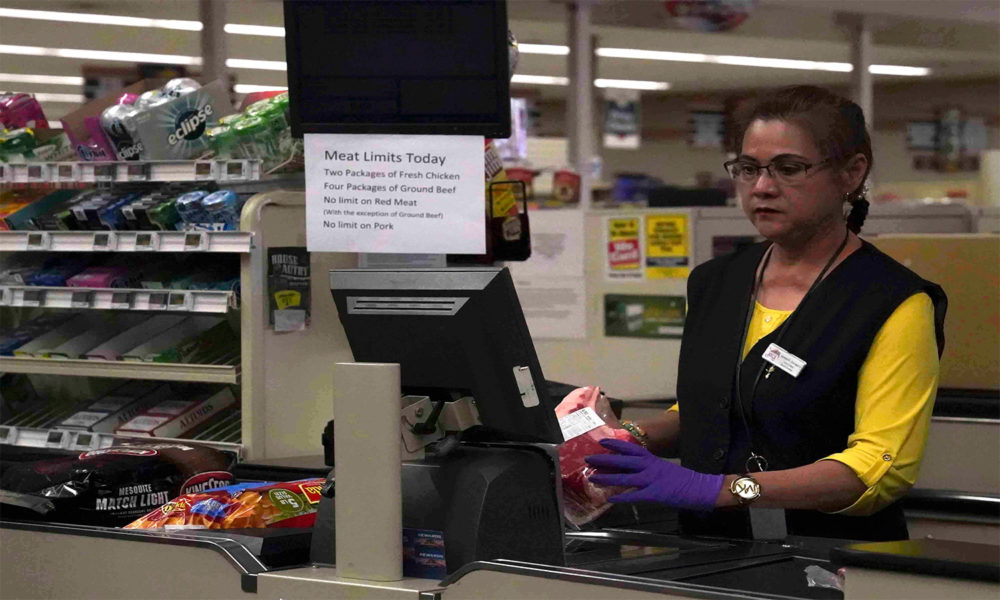
The COVID-19 pandemic has also exposed thousands of essential workers who, during social distancing critical to flattening the curve, continue working to deliver basic products and services to the population. Workers in health care, garbage collection, food and consumer products delivery, and emergency response are among the most exposed to contagion to the novel coronavirus, and many of these labor in low-wage occupations.
Residentially, people living in proximity to hazards like air and water pollution, in coastal and inland flood-prone zones, or in the hottest and most vegetation-deprived neighborhoods in urban heat islands, for example, are more exposed to these hazards.
COVID-19 outcomes are worse for vulnerable populations
Similar to air and water pollution and extreme weather hazards, the impacts of COVID-19 are unevenly distributed among the population. Vulnerable populations—typically low-income communities of color, but also those of advanced age or with preexisting conditions—tend to experience these impacts more than white people in similar circumstances.
In the United States specifically, African Americans are dying from COVID-19 at a disproportionate rate, and we likely do not know what the true burden of disease for non-Whites is, as many Latinos and African Americans are being left out of testing for the virus.
In addition, these groups hold many of the low-wage essential jobs that are getting us through the pandemic, which exposes earners in all categories to COVID-19. Those jobs are truly essential–janitors and health care workers in hospitals, grocery store clerks, farmworkers, etc. Our society could not function without their labor. In addition, African Americans and Latinos are more likely to struggle with poverty and pre-existing medical conditions like diabetes and obesity, which can lead to higher mortality if infected with COVID-19. In the U.S., COVID-19 hospitalizations increase with age, are more common among older adults, and most of those hospitalized had pre-existing conditions.
Environmental Justice (EJ) communities with multiple industrial and toxic sources of pollution in their neighborhoods were just put at even higher risk due to the recent suspension of EPA regulations. This adds to the historical and current cumulative hazards that EJ communities have endured, and many in these communities are at higher risk from COVID-19.
In addition, those already living in poverty and with reduced or zeroed-out wages because of social distancing and the economic meltdown are at risk of utility disconnections, hunger, and hardship at home.
What is the percentage of confirmed COVID-19 cases out of the total population?
In most counties across the contiguous U.S., confirmed cases of COVID-19 represent less than one percent of the population. A few areas stand out, however. In Blaine County, ID, in areas in and around Albany, GA, and New Orleans, LA, the number of confirmed cases represent between 1 and 2 percent of population. New York County, NY (i.e., Manhattan), currently the largest hot spot in the U.S., is at 6.5 percent. It’s important to point out that these numbers do not reflect the true infection rate in a community because as of this writing, large swaths of the population are not being tested.

Using COVID-19 data on the number of cases per county as of April 15, 2020 from the Johns Hopkins University Center for Systems Science and Engineering (JHU CSSE) and total county population estimates from the US Census American Community Survey, this map shows the percent of the population with COVID-19. Note that individuals who tested positive more than once in the same county are double-counted in this calculation.
Where in the US do high rates of COVID-19 coincide with highly vulnerable populations?
While percentage of confirmed COVID-19 cases out of the total population are small, they could present increased risks for vulnerable populations if the largest contagion rates are in counties with many in those vulnerable groups.
In the following maps, I highlight in red counties that have combinations of a high percentage of vulnerable populations and high rates of COVID-19, and that are also adjacent to counties with similarly high values.
Areas in purple also have high rates of the vulnerable population shown in each map but low rates of COVID-19 infections, and are also adjacent to counties with similarly low COVID-19 values.
To be sure, there are other counties in the US with high rates of vulnerable populations, but the counties in these maps have high rates of vulnerable populations, and are close to other counties that also have high rates of vulnerable populations. These groups of red and purple counties are called “spatial clusters” because they are bunched together in space.
In both red and purple areas in the maps, rates of non-Whites, poverty, and people lacking health insurance are high in:
-
- Counties near the Navajo Nation in northeastern Arizona and western New Mexico
- Communities in the South, including
- Along the Mississippi River
- Southern Florida
- In the Gulf Coast in Texas and Louisiana and
- Southern Maryland
- And around the New York metropolitan area.
On average, in counties within red clusters (i.e., with larger vulnerable populations and higher rates of COVID-19) are 50.3 percent non-White, 20.5 percent live in poverty, and 18.5 percent do not have health insurance.
Many of the clusters in these maps cross county and state lines, reinforcing the need for cross-jurisdictional sharing of public health services, a collaborative strategy outlined by the CDC that allows communities to address problems like COVID-19 that cannot be easily solved by a single entity or jurisdiction.
The National Association of Counties has also identified cross-jurisdictional collaboration as a key need, and is advocating for strong intergovernmental cooperation to contain COVID-19 community spread, and protect human health, housing, and tax revenues, among others.
In addition, the CDC advises public health agencies to consider the epidemiology of COVID-19 in surrounding jurisdictions as a key factor to consider when determining local mitigation strategies.
For the reasons stated earlier, the rates presented here are not a true epidemiology of COVID-19 in counties, but arguably, point towards the clusters where high COVID-19 rates intersect with the size and characteristics of local vulnerable populations—another set of factors that CDC says should be considered when determining mitigation strategies.
Counties with high rates of vulnerable populations but low rates of COVID-19 infections (in purple) should not be overlooked, as some of these could conceivably move into the red category if infection rates increase there, emphasizing the importance of containment measures to vulnerable people in those counties. For details on the spatial statistics model I used to create these maps see the methods description here).
Clusters of COVID-19 and percent not White

Red areas in this map show counties that have combinations of a high percentage of non-Whites and high rates of COVID-19, and that are also adjacent to counties with similarly high values. Areas in purple also have high rates of non-Whites but low rates of COVID-19 infections, and are also adjacent to counties with similarly low COVID-19 values. On average, counties in red in this map are 50.3 percent not White.
Clusters of COVID-19 and percent in poverty

Red areas in this map show counties that have combinations of a high percentage of people in poverty and high rates of COVID-19, and that are also adjacent to counties with similarly high values. Areas in purple also have high rates of people in poverty but low rates of COVID-19 infections, and are also adjacent to counties with similarly low COVID-19 values. On average, counties in red in this map are 20.5 percent in poverty.
Clusters of COVID-19 and percent without health insurance

Red areas in this map show counties that have combinations of a high percentage of persons without health insurance and high rates of COVID-19, and that are also adjacent to counties with similarly high values. Areas in purple also have high rates persons without health insurance but low rates of COVID-19 infections, and are also adjacent to counties with similarly low COVID-19 values. On average, counties in red in this map are 18.5 percent without health insurance.
Historical and current vulnerabilities endure in the new pandemic reality
The vulnerabilities I have highlighted here have been shaped in the US over time by historical discriminatory racist practices such as redlining and residential segregation, race-based reduced access to desirable amenities such as adequate housing, temperature-reducing ecological services, education, mortgage and business loans, and employment.
Though many of these discriminatory practices are now illegal, their legacies have endured into the 21st century, and we can see their imprint in deeply inequitable and negative outcomes in health and quality of life, most clearly among low-income communities of color.
In the current pandemic moment, the impacts of racism on disparities in exposure to, and outcomes from COVID-19 are being felt right now by many communities of color, and adding to this is the corollary that social distancing and working from home are privileges that many communities of color are not enjoying. Current measures to more speedily contain the virus are so important for society’s most vulnerable—whether they have to go work or are staying at home and hoping that food and other basic services don’t run out.
But even before COVID-19, long-standing social and environmental injustices widened into a chasm the gap in the vulnerable population’s capacity to resist and bounce back from climate change impacts.
In the US, the dismantling of the social and public health safety net, increased cost barriers to access health care, four decades of austerity prescribed by the neoliberal model, an affordable housing crisis, and failure to integrate existing and projected climate change in disaster mitigation and resilience planning have magnified longstanding socioeconomic and health disparities among low-income people of color. The new pandemic reality is magnifying these vulnerabilities right before our eyes.
The pandemic will continue for some time but will not endure. Human ingenuity and science will eventually reduce the threat to our lives. This is not wishful thinking: there is already international collaboration on a scale and focus not seen before among the scientific community on defeating the novel coronavirus.
While it’s hard to predict long-term health consequences, if the inequities of history are any guide, vulnerable communities will suffer the worst and longest economic and well-being consequences. For environmental hazards writ large, and climate change and now COVID-19 threats in particular, lasting and real solutions will require the equitable design and implementation of policies that address the root causes that have rendered some people more vulnerable than others to so many threats.