Late Monday afternoon, the National Review tweeted out a marvelously boneheaded graph it breathlessly called “the only #climatechange chart you need to see.” To wit:

See? The data don’t lie! Look how little warming there has been since 1880. That is, if you extend the Y-axis by absurd levels. The range goes from an average global temperature of -10 to 110. Presumably, on the high end of the spectrum, many places would have heat waves in the 180s or 190s. We start to feel pain at 111 degrees and human skin is instantly destroyed at 162 degrees. So if the average temperature were to be 110, well, every summer our skin would fall off. Instantaneously.
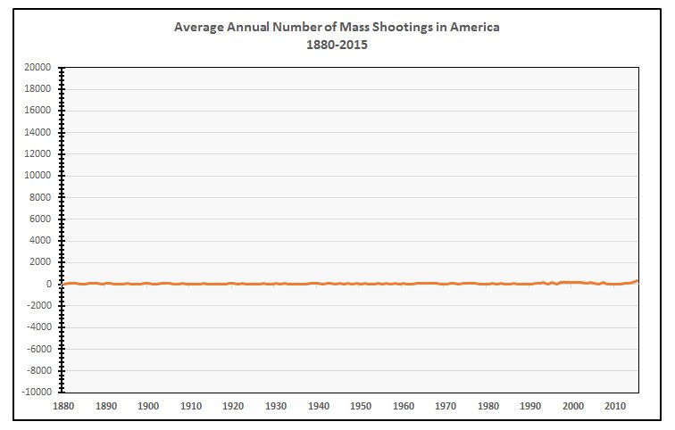
It didn’t take long for the Twitterati to start making their own graphs. Worried about mass shootings in America? Well @Jonnysun has the chart to convince you there’s no problem at all:
Concerned about the national debt? Never fear, says Sean McElwee:

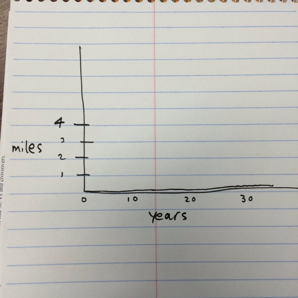
Our own Seth Michaels lamented that he never really had a meaningful growth spurt:
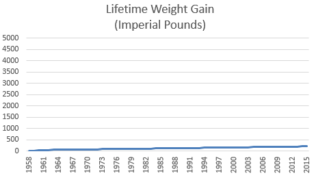
Jim Petit is happy that his weight has remained virtually unchanged since his 20s (and since his birth):
And some took comfort in the idea that nobody really reads the National Review online:

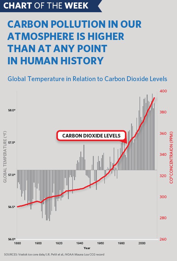
Fortunately, there were some people who responded with more useful graphs that help us understand what changes have occurred more in line with an Earth that is actually habitable: