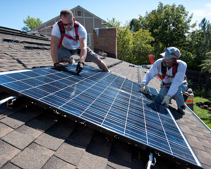
The spring equinox is a fine time to celebrate the sun. And, for the solar power lovers among us, it’s a great time to take stock of how much sun is available for rooftop solar across the country.
When we do, we find that, over the course of the year, the sun for solar power generation is actually much more evenly distributed than sunny-Southwest-postcards-vs.-Northern-snow-scenes would suggest. It’s also more evenly spread than typical solar maps would lead you to believe. Here’s a better way to see how much you’ve got.
What does a better map mean for you?

Will solar work for my house? It’s worth investigating. (Source: NREL)
A good solar map will allow you to get a ballpark sense, right off the bat, of how well solar panels might perform where you live. If you live in the Sunbelt, you already know you’ve got lots of sun. But elsewhere, the right map might just help you understand that you have a lot more sun than you might imagine.
Solar maps can show how much you might get from a set of solar photovoltaic (PV) panels in a given area. One way to show the variations is to use different shades of the same color. The map below, from the National Renewable Energy Laboratory (NREL), is one of the best out there, and uses that approach.

A fine map, but not proportional enough for my tastes. Click to enlarge. (Source: NREL)
But in many such maps, including this one, the gradations aren’t proportional. That is, the shading drops much more quickly than the solar resource numbers do. The area corresponding to 3.0 kilowatt-hours per meter squared (kWh/m2), for example, looks much lighter than 6.0, not just half as color-rich.
Note that this version is a decided improvement on earlier ones, some of which moved to a whole different part of the color wheel to highlight the differences, with parts of the country with less sun showing up in blue or green—conjuring up images of people living under an alien sun, rather than our sweet (if somewhat less present) golden one.
Putting things in perspective
A map with proportional color shading, such that areas with half the solar resource are half as shaded, can give you a better sense of your relative sun-ness from the get-go. Consider this version:

Solar (almost) everywhere. Click to enlarge. (Source: UCS Solar Power on the Rise)
When you look at this one, it’s easy to see why NREL has chosen the approach they have. Proportional gradations make the half-kWh increments too hard to distinguish (we know, we tried; see the sample below). For clarity’s sake, the map above has the areas grouped together in increments of 1 kWh/m2/day. (And even then we had to play with the shading proportions a tad, just to make the differences visible.)

With proportional shading and half-kWh increments, it’s tough to see the changes.
A few other things to note about our map:
- Like the NREL original, it indicates how much electricity you’d be able to produce with a given amount of PV in a particular location. That’s not just about how much sun you have; temperature also plays a part, since, like most electronics, PV modules actually do even better when things are on the cooler side.
- Both maps also consider the optimal tilt for the PV modules. For best year-round production, that turns out to be the latitude of your location. Having panels flatter would produce less overall, but more during the important spring/summer period.
- These maps are for PV. Various factors mean that, for concentrating solar power (CSP), the resource really is more concentrated (as it were) in certain areas of the country, at least for utility-scale applications.
The excitement of boring
The biggest thing to note about the PV solar map might be just how similar so much of the country looks. How beautifully boring. Excitingly so, really.
Here’s an example of how much more uniform the sun is than you might think: imagine putting a PV system in Portland, Maine. It turns out that system could on average generate 85 percent of what the same system could in Los Angeles, and 95 percent what it could in Miami. And it could generate 6 percent more in Portland than in Houston.
So how much could you generate where you are? After the map has inspired you, a good next step can be checking out NREL’s handy PV resource tool. Or asking your neighborhood solar installer to do the math for you.
And in the meantime, this equinox, celebrate the exciting widespread-ness of our solar resource.
(Except during this Friday’s eclipse, when all bets are off.)
