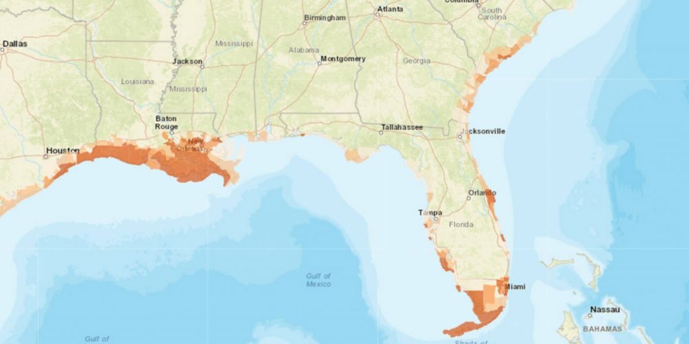
Last week, the Union of Concerned Scientists released a report showing sea level rise could bring disruptive levels of flooding to nearly 670 coastal communities in the United States by the end of the century. Along with the report, UCS published an interactive map tool that lets you explore when and where chronic flooding–defined as 26 floods per year or more–will force communities to make hard choices. It also highlights the importance of acting quickly to curtail our carbon emissions and using the coming years wisely.
Here are a few ways to use this tool:
- Explore the expansion of chronically inundated areas
Sea level rise will expand the zone that floods 26 times per year or more. Within the “Chronic Inundation Area” tab, you can see how that zone expands over time for any coastal area in the lower 48 and for two different sea level rise scenarios (moderate and fast).

Explore the spread of chronically inundated areas nationwide as sea level rises.
- Explore which communities join the ranks of the chronically inundated
We define a chronically inundated community as one where 10% or more of the usable land is flooding 26 times per year or more. With a fast sea level rise scenario, about half of all oceanfront communities in the lower 48 would qualify as chronically inundated. Check out the “Communities at Risk” tab to see if your community is one of them.

Explore communities where chronic flooding encompasses 10% or more of usable land area.
- Visualize the power of our emissions choices
Drastically reducing global carbon emissions with the aim of capping future warming to less than 2 degrees Celsius above pre-industrial levels–the primary goal of the Paris Agreement–could prevent chronic inundation in hundreds of U.S. communities. Explore the “Our Climate Choices” tab to see the communities that would benefit from swift emissions reductions.

Explore how slowing the pace of sea level rise could prevent chronic inundation in hundreds of US communities.
- Learn how to use this time wisely
Our country must use the limited window of time before chronic inundation sets in for hundreds of communities, and plan and prepare with a science-based approach that prioritizes equitable outcomes. Explore our “Preparing for Impacts” tab and consider the federal and state-level policies and resources that can help communities understand their risks, assess their choices, and implement adaptation plans. This tab captures how we can use the diminishing response time wisely.

Explore federal and state-level resources for communities coping with sea level rise.
Improving the map based on data and feedback
We hope that communities are able to use this tool to better understand the risks they face as sea level rises. We welcome your feedback and will be periodically updating the map as new data and new information comes to light.

