Beginning next month, when overseas ballots go out from North Carolina, more than 150 million US voters will come together to take part in the 2024 general election.
As results begin to come in, the Union of Concerned Scientists’ new precinct-level analysis of 2020 voting in several battleground counties will provide context for the election as it unfolds in the swing states that will likely determine the presidency: Allegheny (Pittsburgh) and Philadelphia counties in Pennsylvania; Columbus, Durham, and Mecklenburg counties in North Carolina; Cuyahoga (Cleveland) and Lorain counties in Ohio; Fulton County (Atlanta) in Georgia; Maricopa County in Arizona; Milwaukee County in Wisconsin; and Wayne County (Detroit) in Michigan.
The data provide a landscape, an interactive map, that shows who participated in the 2020 election, and whose ballots were more likely to be counted.
Key findings
Neighborhoods that make up battleground counties are marked by extreme inequalities in voter turnout. Two voters may reside just a few miles from one another, in roughly equally populated neighborhoods, but one’s community may exercise only a quarter of the voting strength of the other voter’s neighborhood.
Such turnout disparities, while common in US metropolitan areas, are far more consequential in battleground counties considering the number of potential votes left on the table. Joe Biden’s 2020 Electoral College victory came from fewer than 45,000 votes in Arizona, Georgia, and Wisconsin, despite his winning nearly 7 million more votes than Donald Trump nationwide.
The analysis shows that voters in low-turnout precincts are also more likely to encounter problems voting, including having their ballots rejected. Geographic inequalities in political voice are thus cumulative. The analysis illustrates the potential value of improving election data transparency: our interactive map allows people to see their community’s level of participation, as well as how they compare with other neighborhoods, not only in terms of voter turnout, but also the likelihood that people will have problems casting ballots, or having their ballot rejected, compared to other communities.
Precinct-level analysis provides a far more detailed picture of how the process of voting and validating ballots impacts the representation of specific communities. Thousands of ballots in these counties were rejected in 2020 due to problems verifying voter eligibility, and tens of thousands of eligible voters never made it to the polls.
The racial turnout gap
Since the passage of the Voting Rights Act in 1965, a central measure to assess participatory and political equality in the US has been the difference in voter turnout across people of different races, also known as the racial turnout gap.
Recent scholarship has demonstrated that election laws ranging from redistricting outcomes, to registration list management, methods of voting, and identification requirements can have differential impacts on racial groups in terms of propensity to vote, ability to vote, and the probability that votes are counted.
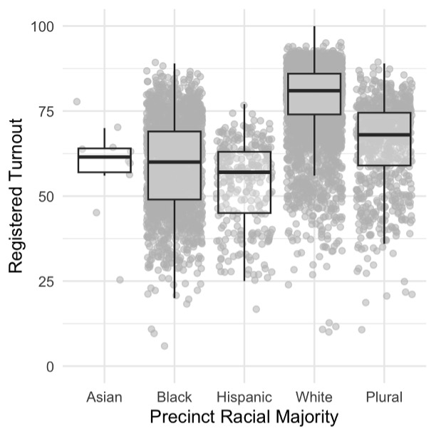
The continuing relevance of race is reflected in systemic turnout inequalities observed across communities of color. In Figure 1 below, precincts are categorized according to the racial identities, based on Census categories, of the majority of the citizen voting age population (CVAP) in that precinct.
The results show that 2020 turnout was highest in majority-White precincts and lowest in majority-Black and majority-Hispanic precincts, with majority-Asian/Pacific Islander (API) and Plural (no racial majority) precincts in between. Controlling for state- and county-level effects does not erase the observed turnout gap between majority-White and majority-minority precincts.
In other words, even if inequalities in voting access, differences in electoral competition, and other political factors cause inequalities in turnout, the differences observed in Figure 1 are not just a function of which county or state a person lives in.
Rather, these observed inequalities are a function of the types of communities that people live in, and their prevalence. As Figure 1 shows, while the average turnout differences across racial communities are stark, there are high- and low-turnout precincts within each group as well. Many majority-Black precincts turned out at rates higher than the average majority-White precinct in 2020. Similarly, turnout rates in some majority-Hispanic precincts were close to the average turnout in majority-White precincts.
But turnout inequalities across racial groups are intensified by the greater proportion of low-turnout precincts that are majority-Black or majority-Hispanic, relative to majority-White precincts. In about one-quarter of majority-Black precincts (484) in these pivotal counties, fewer than half of registered voters cast a ballot in 2020. Similarly, while the total number of majority-White precincts where fewer than half of those registered voted (107) was larger than the number of majority-Hispanic precincts (86) with turnout less than 50 percent, that is nearly one third of all majority-Hispanic precincts, compared to just 3 percent of majority-White precincts.

Cumulative voting inequalities
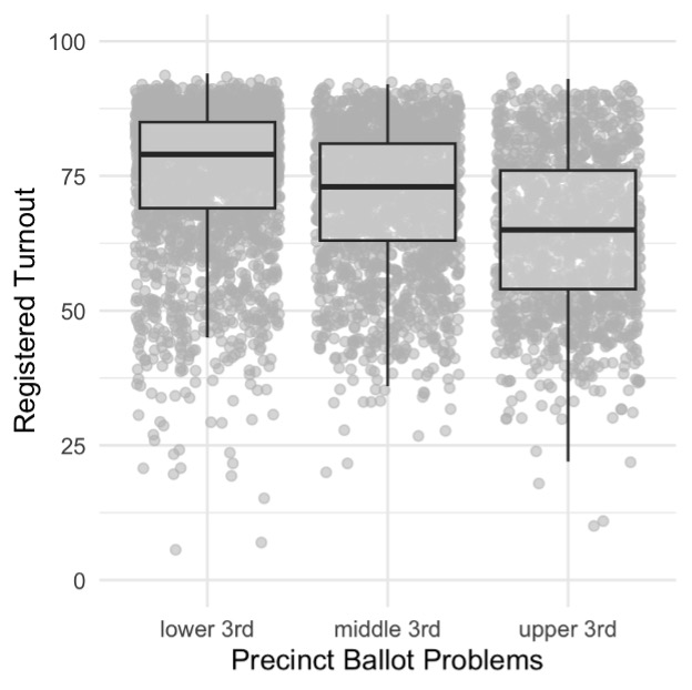
People living in low-turnout precincts in battleground counties were also more likely to have their ballots rejected in the 2020 general election. As Figure 2 demonstrates, average turnout is highest in the third of precincts with the lowest ballot incident rates, and lowest in the upper third. That is, the frequency of ballots not cast, as well as ballots cast but not counted, are correlated. This correlation remains statistically significant after controlling for both regional effects (differences across state and county) and the racial composition of precincts.
That is, both within and across these counties, people living in communities that suffer from lower turnout are also subject to higher rates of ballot rejection and related incidents, including having to use a supplemental or provisional ballot, which is one cause of higher rejection rates. Political representation is weaker in these communities, relative to communities with high turnout and low rejection rates.

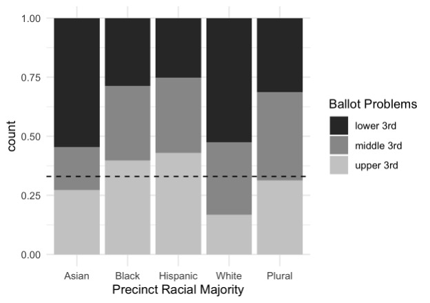
Looking again through the lens of which Census-defined racial groups make up CVAP majorities in precincts, we compare the percentage of precincts that are in the upper third or “high-incident” precincts across racial groups.
As Figure 3 illustrates, we find substantial inequalities in rejection rates across communities of different racial composition. The intuition behind Figure 3 is that if race were not a factor in rejection rates, we would expect each of these bars to top out at 33 percent, or one third of all the precincts in each jurisdiction. Instead, we observe that around 40 percent of majority-Black and -Hispanic precincts are in the high-incident category, compared to less than 20 percent of majority-White precincts. The percentage of high-incident Asian/Pacific Islander precincts is also below equality expectations, while racial plurality precincts are quite close to the expected 33 percent mark.

The statistical picture is alarming, and constitutes an observable, legitimate threat to electoral integrity. Majority-Black and Hispanic communities cast fewer votes, but are also more likely to have problems with votes cast. It was beyond the scope of this analysis to determine if the greater frequency of ballot problems in these communities results from more ineligible voters attempting to vote, or higher rates of voter or administrative error, but other studies have suggested that processing errors contribute to racialized disenfranchisement.
Challenges and solutions
These political inequalities are responsive to procedural solutions. Improving data transparency, which would allow for better monitoring and assessment of the whole electoral ecosystem, would improve electoral integrity, and possibly confidence in elections.
Consider the range of turnout within majority-Black neighborhoods. Residents of Philadelphia’s Cedarbrook neighborhood and the Cleveland suburb of Bedford Heights are 90 and 81 percent Black, respectively, and both exhibit high turnout rates (84 and 82 percent, respectively). By contrast, in neighborhoods like Kensington precinct 15, part of Philadelphia’s 25th Ward, and Cleveland’s Ward 5, precinct b, less than one-third of registered voters cast ballots.
What separates these high- and low-turnout communities is poverty: nearly two-thirds of the population in Kensington and Ward 5 live below the poverty level, compared to just 10 percent in Cedarbrook and 11 percent in Bedford Heights. More than any other social condition, concentrated poverty erodes the cooperative networks on which democratic participation depends.
While inequalities in voter turnout are more persistent and rooted in deeper social inequities, democratic capacity can be cultivated even in hostile conditions. Local civic organizations can also benefit from greater data transparency and data sharing in partnership with local election administrators.
Pilot programs in Cleveland’s 5th Ward show how integrating data science into relational organizing campaigns can improve contact and commitment rates among low-propensity voters with the ability to update and maintain more accurate voter files, especially in the weeks leading up to Election Day when mobilization efforts peak.
This analysis is the latest example of the Union of Concerned Scientists’ commitment to harnessing science and scientists as guardians of democracy and provides a powerful foundation to advance equity and meaningful public participation in the future.

