We live on a (nearly) spherical planet. Until recently, this was one of those facts that I knew in the back of my mind, but didn’t really think about.
Like how there were other members of Destiny’s Child besides Beyoncé. Sure, I knew that Kelly and Michelle existed (mostly cause of that intro to Bootylicious), I just hadn’t really thought about them.
But wow have things changed. Not only am I embarrassed by my neglect of two women who sang the soundtrack of my adolescence, but since I started working with maps and geospatial data, I think about Earth’s sphericity ALL. THE. TIME.
Maps, maps, maps
Right off the bat, we’ve got to acknowledge that all maps are wrong. This doesn’t mean that some maps aren’t useful, but they’re wrong precisely because our Earth is (nearly) spherical. It’s impossible to take a sphere, put it on a flat surface and accurately represent the shapes, sizes, directions, and distances between its features.
This is where map projections come in: any given projection will compromise most of these features to preserve the integrity of one.
In most situations, map projections are a tool that we can use to better understand our world, where purpose dictates projection (navigation, calculating land area, displaying satellite imagery etc.). We even have regional projections that are designed to be most accurate in one specific area, like Alaska Albers that dampens the intense warping that projections often produce near the poles. However, when projecting a global map, these unacknowledged distortions can have profound consequences.
To fully appreciate how these projections inform our understanding of Earth’s most basic geography, we need to project an image of known dimensions, an image with which we are so familiar that even the smallest modification to the length or shape of its features jumps off the screen…
An image like Beyoncé’s face.

If I were a map
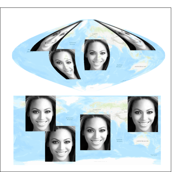
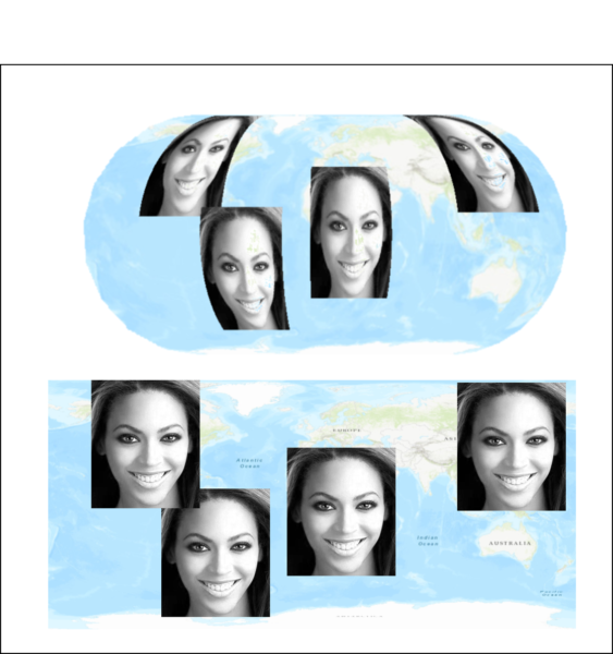
To do this, I embedded geographic information (aka geo-referencing) into four identical photos of Queen Bey, and then re-projected these images to the globe using several common map projections. I specified that her face should take on the approximate locations of North America, South America, Africa and Eastern Asia so without projections we might expect our map to look something like this:

However, when we start to do the re-projections, it’s easy to spot the distortion.
Ring the alarm
In most of our nation’s schools, global maps are displayed in the Mercator projection.

We can see above that the Mrs. Carter is clearly warped in North America and Asia. However, this is only obvious because we already know how Beyoncé looks. When it comes to the continents, we’re getting distorted information right off the bat without ever being told that it’s wrong!
The Mercator projection was originally designed for navigation and while Bey looks like herself near the equator, areas around the poles are stretched out and appear way larger than their actual land area. In the northern hemisphere, this not only affirms a US and Euro-centric world view, it also makes Antarctica seem like the world’s largest continent, when that’s definitely not the case.
Irreplaceable?
Like me, this is probably the map that has shaped your view of global geography. And also like me, you may not have known that other projections exist.
But they do. Put another way: we don’t have to use this one, we have options.
Depending on the purpose, these projections vary. As a scientist, when I’m doing analysis that explicitly considers where something is located in space relative to anything else, I have to ensure that all maps from which I’m gathering data are in the same projection. Or I have to re-project each map to make sure that they match. And based on the pictures below, you’ll see how mismatched projections could cause problems and why some maps aren’t intended to teach global geography.
We’ve got the Sinusoidal, which is one of the projections used for satellite data like MODIS, which takes daily photos of Earth’s surface and is an incredibly important tool for climate and global change scientists alike.

Sinusoidal projection
And the Azimuthal projection, which is often used for calculating flight distances because it maintains accurate distances.

Azimuthal projection.
We’ve also got my personal preference, the Eckert IV projection, which is a great example of an equal area projection, where we can see some distortion, but the shape and size of Bey’s face is relatively consistent. This is similar to the Peters Projection, which has gained popularity in recent years, most recently being adopted by Boston Public Schools.

Eckert IV projection
While I’ve highlighted several projections that I’ve used in my work, there’s a whole world of projections out there.
Listen
If Queen Bey hasn’t convinced you, let’s use Greenland and Africa to drive this point home. Based on this standard Mercator map, I would wager that Greenland’s area can fit inside Africa’s about 1.5 times.

A classic Mercator projection, Beyoncé is noticeably absent.
But if anyone took that wager, I would lose all my money.
If we look at this global and spherical representation of the two continents, it clearly shows that Africa is WAY bigger than Greenland, nearly 14 times bigger actually. Greenland barely holds a candle to Algeria much less the entire continent.

Google recently changed their wildly popular mapping platform to include a spherical view of the globe once you zoom out completely.
Hold up
As Beyoncé and Greenland both illustrate, all maps are wrong. But maps and map projections are incredibly useful tools. As scientists, being explicit about projections ensures the accuracy of our work and allows us to better understand the world.
As far as education is concerned, I’m not suggesting that we only use globes to teach children or ceremonially burn Mercator projected maps. Rather, I’m suggesting that we teach maps as a tool (in all our schools not just Boston) and not as absolute, geographical truth. I’m suggesting that we move away from a projection that affirms a US and Euro-centric world view. Because when we work towards equity, and specifically equity in scientific realms, there’s no detail too small to deserve attention. Inequities persist when we leave the status quo uninterrogated, even for something as seemingly innocuous as a map.

