
[With costs dropping and scale climbing, wind and solar have been going great guns in recent years. Shannon Wojcik, one of the Stanford University Schneider Sustainable Energy Fellows we’ve been lucky enough to have had with us this summer, worked to capture that movement for your state and its 49 partners. Here’s Shannon’s graphic, and her thoughts about it.]
Do you ever wonder how much energy those rooftop solar panels in your state are contributing to renewable energy in our country? How about the wind turbines you see off the highway?
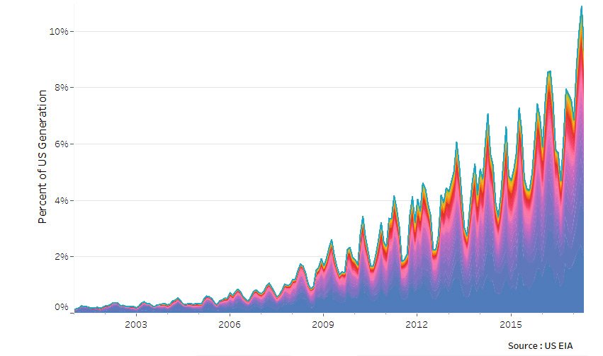
Our new “rainbow mountain” graphic lets you see your state’s piece of solar and wind’s quickly growing contribution to the US electricity mix. It shows how much of our electricity has come from wind and solar each month for the last 16 years. Just click on your state in the graph’s legend or roll your mouse over the graphic to see what’s been happening where you live.
At first glance, this graphic looks like a disorderly rainbow mountain range. Keep staring though (try not to be mesmerized by the colors) and you can start to see patterns.
The peaks in the mountain range seem to be methodical, as well as the dips. The peaks where the most electricity is supplied by wind and solar can be seen in spring, where demand (the denominator) is lower due to moderate temperatures, and generation (the numerator) is high due to windy and sunny days. The crevasses, in July and August, happen because demand for electricity is high at those times thanks to air conditioning, increasing the overall load on the US grid—and driving up our calculation’s denominator. If you were to look just at monthly generation of wind and solar, this variation would be smaller.

Another, much more obvious thing about the mountains is that they’re getting taller. In fact, we passed a notable milestone in March of 2017, when, for the first time, wind and solar supplied 10% of the entire US electricity demand over the month. In 2012, solar and wind had only reached 4.6% of total US generation, so the recent peak meant more than a doubling in just 5 years.
That’s momentum.
Climbers and crawlers
Being able to see the different states lets you see where the action is on wind and solar—which are the climbers and which are the crawlers.
You know the saying about how everything is bigger in Texas? Well, that certainly holds true here. Texas is the bedrock of this mountain range, never supplying less than 14% of the wind and solar for the entire US after 2001. Even supplying as much as 35% some months. Texas hosts the largest wind generation, and doesn’t seem to be in danger of losing that title anytime soon.
California is another crucial state in this mountain range, and has been from the beginning. California was building solar and wind farms years before the other states, a trendsetter; in 2001, it was supplying up to 75% of all the wind and solar electricity in the US. California is still the second largest supplier of wind and solar.
Other notable states that are building this solar and wind mountain are Oklahoma, Iowa, Kansas, Illinois, Minnesota, Colorado, North Dakota, Arizona, and North Carolina. Most of these states are rising up due to wind, but Arizona and North Carolina, along with California, are leading with solar.

Investments in renewable energy facilities, like this wind farm in southern Minnesota, is a direct result of Minnesota’s ongoing efforts to build a cleaner, more sustainable, and lower-risk energy future for its ratepayers.
Not all states with strong solar and wind performances by some metrics show up here. South Dakota is #2 for wind as a fraction of their own generation, though on this graphic it’s barely visible.
What does this mean?
This graphic shows that the momentum of solar and wind growth in the United States is undeniable. It can be seen on rooftops, in windy valleys and on windy plains, and even in states where coal has been king. All 50 states are involved as well, as every state generates electricity with wind and solar.
There are many ways for your state to increase its overall percentage. It can either decrease its denominator with energy efficiency or increase its numerator with wind and solar installations.
Not satisfied with where your state shows up on this graph? Check out what more your state can do.